


BLOG DETAILS
"We Tore Apart 3 SaaS Onboarding Flows. Here's What Actually Kills Trial-to-Paid Conversion"
Home Blog
Blog
Blog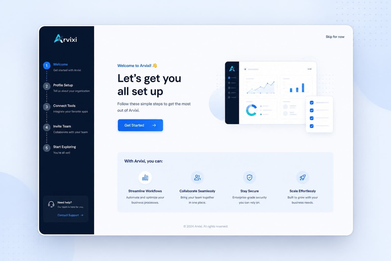
Experience & Commerce
We Tore Apart 3 SaaS Onboarding Flows. Here's What Actually Kills Trial-to-Paid Conversion
Three out of four SaaS free trial users never become paying customers. That is not a niche problem with a niche fix. It is the largest addressable revenue leak in most SaaS businesses, and the research is unusually consistent about where it actually happens: not at the pricing page, but in the first five minutes after sign-up.
We looked at the patterns across the current research on SaaS onboarding UX and the failure modes repeat with almost no variation across product categories. Here is the breakdown, in the order the failures actually occur.
Failure 1: No aha moment in the first session
Users who interact with a product's core features in their first three days convert at four times the rate of users who don't. Product Led's research puts the critical window even tighter: the conversion cliff can begin as early as seven minutes into the first session. Every required setup step, every form field, every wizard screen that delays the moment the user sees real value compounds abandonment before it has a chance to start.
The fix that shows up across every well-performing product studied: pre-fill the user's first project, workspace, or document with sample content they can immediately edit, rather than asking them to create from a blank slate. Notion, Figma, and Canva all default to this, and it is not a coincidence. An empty state is not neutral. It is friction with nothing to show for it.
Failure 2: Feature overload disguised as thoroughness
A new user facing 30-plus clickable elements on their first screen does not explore. Psychologists call this Hick's Law: the time it takes to make a decision increases with every additional option presented. Faced with that much choice, users freeze rather than engage.
Progressive disclosure is the consistent fix. Show three to five things on day one. Add complexity as the user's own usage justifies it. Linear, the project management tool, starts every new user with exactly three visible sections. The dashboards that get this wrong show every available chart and filter from minute one, with no context for what any of it means or which numbers actually matter for a brand-new account.
Failure 3: Missing progress feedback
A trial user completes five onboarding steps and has no idea how many remain. This triggers what researchers call the Zeigarnik effect in reverse: instead of an open task creating productive tension that drives completion, an invisible finish line creates the sense that the task may never end, and users abandon rather than push through uncertainty.
The fix costs almost nothing to implement and is one of the more reliably underused patterns in the research: a visible step counter, "step 3 of 5," changes completion behavior measurably, even though it adds no functional value to the product itself.
What time-to-value actually does to your conversion number
Self-serve B2B SaaS products that deliver their core value in under five minutes consistently outperform products that take twenty. The data is specific here: every extra minute added to time-to-value costs approximately 3% of trial-to-paid conversion. Cutting time-to-value by 20% has been measured to lift ARR growth by 18% in mid-market SaaS, according to Amplitude's research, which means this is not just a UX nicety. It is a revenue lever with a measurable multiplier attached.
Role-based personalization compounds this further. Showing identical onboarding to a marketing manager and a software engineer leaves real conversion on the table, since they came to the product for different reasons and care about different first wins. The lift from this kind of personalization runs as high as a 40% improvement in retention compared to a generic flow.
The trial model decision that matters more than any onboarding tweak
Before any in-trial optimization, the structural decision of opt-in versus opt-out trials creates a performance gap on its own. Opt-out trials requiring a credit card upfront convert at roughly three times the rate of opt-in trials with no card required, though they also produce meaningfully fewer signups in the first place. Neither model is universally correct. The decision has to align with your product's complexity, price point, and how much friction your specific buyer will tolerate before they have seen any value at all.
What this means before your next onboarding redesign
Three things to check before redesigning anything visually.
Map exactly where users stop progressing, not where the interface looks dated. "What looks bad" and "where do users actually quit" are different questions with different, sometimes contradictory, answers.
Measure your real time-to-value in minutes, honestly. If it is closer to twenty than to five, that single number is very likely costing you more conversion than any pricing or messaging change would recover.
Pull your last ten churned trial users and ask why they left. If more than three give the same answer, that is your actual benchmark problem, and it is almost never the price.
The companies converting at 35% to 45% are not winning on a better product. They are winning because a user reaches real value inside the first session, with no required setup standing between sign-up and that moment. Everything else is optimization around the edges of that one decision.


